What You Can Learn From Energy Data
Analysis of energy data is best done before you go into the field to do a site visit at the building because the analysis can lead to insights that need further investigation at the building, questions to ask the energy manager, and will start to give you a sense of what energy conservation measures you'd like to further look into when at the site.
Jump to an analysis of monthly energy data.
Jump to an analysis of hourly energy data.
Patterns and trends to look out for in the data analysis:
-
Does the energy use match the expected seasonal trends? e.g. is natural gas higher in the winter when more heating is needed?
-
Does the energy use give hints to building occupancy? e.g. is energy use lower on off-business hours compared to business hours?
-
Are there any recent changes in energy use or abnormalities in the data that need further investigation in the field? e.g. a recent increase in energy use in the last few months warrants further investigation
Your analysis of the data, and what you can learn from the data, will depend on the data you have access to. The granularity of the data will have a big impact on the analysis you can do. For example, if you have monthly data you will be able to look for seasonal trends but not daily or hourly trends that correlate to the building's occupancy (because your data isn't granular enough for this analysis).
Analyzing Monthly Energy Data
In a small/medium-sized commercial building, energy use is typically electricity and natural gas usage. Using the data from monthly utility bills, or smart meter data, a bar graph is a simple way to gain insights from the data. In your bar graph, the x-axis should be the months of the year, and the y-axis should be your energy units (typically kWh for electricity and therms for natural gas).
Examples from a UC Davis office building.
The data below is monthly energy data from an office building on the UC Davis campus. Similar to a building you may find out in the field, this building uses natural gas for heating. However dissimilar to a building you may find out in the field, this building uses chilled water for cooling. In a small/medium-sized commercial building, you may have electricity used for cooling in the building.
Monthly Natural Gas Usage
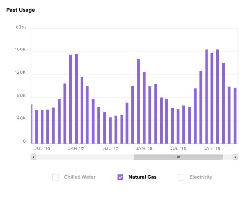
A pattern that jumps out is the seasonal use of natural gas. Use is higher in the months of November through March. This pattern is expected because more heating is used in the winter months.
Monthly Electricity Usage
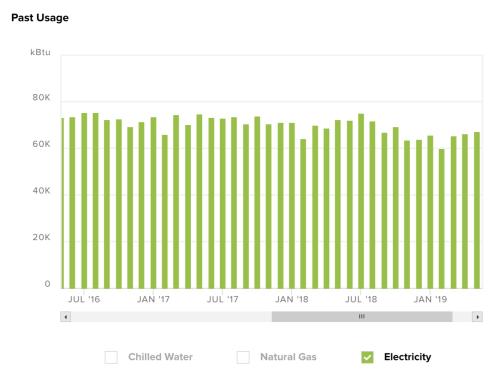
It's noticeable that electricity use is relatively stable throughout the year. Since electricity is used for plug loads, HVAC fans, and lighting this pattern is expected. However, if your building uses electricity for cooling the pattern of use will look more like the graph below.
Monthly Chilled Water Usage
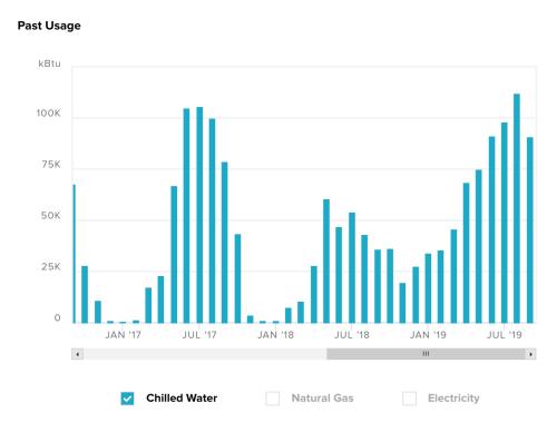
What looks questionable about this graph is the higher use in the winter of 2019, something to ask the building manager about.
Taking Notes of Energy Data Trends
It's important to consider several factors when looking at the energy data of a building, particularly when you see an abnormal pattern in the data or an increase in energy use. However, you don't need to answer any questions you have or solve the puzzle of the patterns you see before going into the field to investigate in the building. Take notes on what you're seeing and note any hypotheses you have to further explore in the field.
Examples of items to note:
-
Does it look like there may be on-site solar?
-
Does energy use changes with the cost of energy?
-
Does the energy data change with the seasons, and is it what you would expect?
-
Is there anything in the data that indicates a change in the building? For example, an addition/expansion or renovation?
-
Is there anything in the data that indicates a previous energy audit, energy conservation or energy efficiency project?
Analyzing Hourly Energy Data
If you are able to get access to hourly energy data, there are a lot of insights you can get from a more granular dataset. Unlike a monthly bar graph, hourly data is better suited for a line graph. On you x-axis will be the hours in a day and on the y-axis will be your energy use.
One way to graph hourly energy data to show patterns in occupancy and fluctuations in business hours is to graph a typical day for each day of the week. Your x-axis will be the 24 hours in a day, created by averaging each hour of the day across all of the data you have (but separated out by the day of the week). The resulting graph will be seven lines, one for each day of the week.
The graphs below show hourly electricity data, measured in kW. There are different graphs for different types of buildings because the patterns in hourly electricity data are different between an office building versus a classroom building.
A Typical Commercial Building
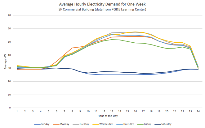
The lines representing Monday through Friday show electricity use starting at 6am, continuing through 11pm. Something to note is a potential opportunity to trim the electricity usage to reflect the occupancy of the building.
An Energy Intensive Building
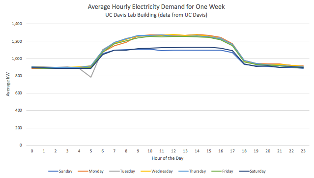
Based on the graph below, we can see that the days of the week have a very similar trend in electricity. The darker blue lines show that the weekends have slightly lower energy demand compared to the weekdays, but there is still quite a bit of energy use. In see a building with high energy demand, it's important to find the pieces of equipment in the building that use the most energy. Increasing the efficiency of these high energy users will have more of an impact on the whole building.
A Building with Variable Occupancy
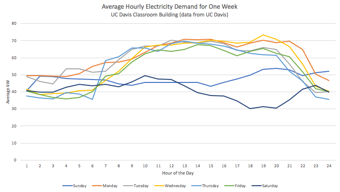
One main takeaway from this graph is how variable each day of the week is, and if your graph looks like this it's important to note to ask the building manager about the occupancy of the building. A graph that is variable could signify there is variable occupancy in the building, in which case you should match the expected occupancy to the energy data. Or, the graph could signify a potential to save energy if the energy data doesn't match the actual building occupancy.
Taking Notes of Energy Data Trends
Taking notes on your data analysis will give you questions to ask the building manager, and maybe even the building occupants. Describe what you're seeing and note any hypotheses you have to further explore in the field.
Examples of items to note:
-
Does the energy demand for different days of the week look different?
-
Are there outliers affecting the average 24 hours representing a certain day of the week?
-
Does it look like occupancy is predictable, or does it not follow any particular pattern?
-
How much energy is used consistently, regardless of the hour of the day? Aka what is the baseload energy demand?
-
Where is there room to decrease energy consumption?
-
Is there anything in the data that indicates a recent change in the building? For example, an addition/expansion or renovation?
-
Is there anything in the data that indicates a previous energy audit, energy conservation or energy efficiency project?